Government branding is not a cosmetic exercise; it is how a public body signals legitimacy, clarity, and service quality. In the UK, that matters because people judge the institution, the message, and the service at the same time. This article breaks down the identity choices, governance rules, and practical steps I would use to keep a government body recognisable, accessible, and trusted.
What matters most before you touch the logo
- Public-sector branding in the UK is primarily about trust, transparency, and recognisability.
- The strongest systems separate parent brand, departmental identity, and campaign identity instead of mixing them.
- Accessibility and plain language are not extras; they are part of the brand experience.
- Co-branding, exemptions, and partner logos need tight rules or the public image fragments fast.
- You should measure recognition, trust, usability, and governance quality, not just reach or impressions.
What the public image is really supposed to do
In the public sector, a brand is not there to sell. It is there to help people understand who is speaking, whether the message is official, and what action they should take next. That sounds simple, but it is the point where trust is won or lost. If a citizen cannot quickly tell whether a letter, website, ad, or social post is genuinely from the state, the brand has already failed.
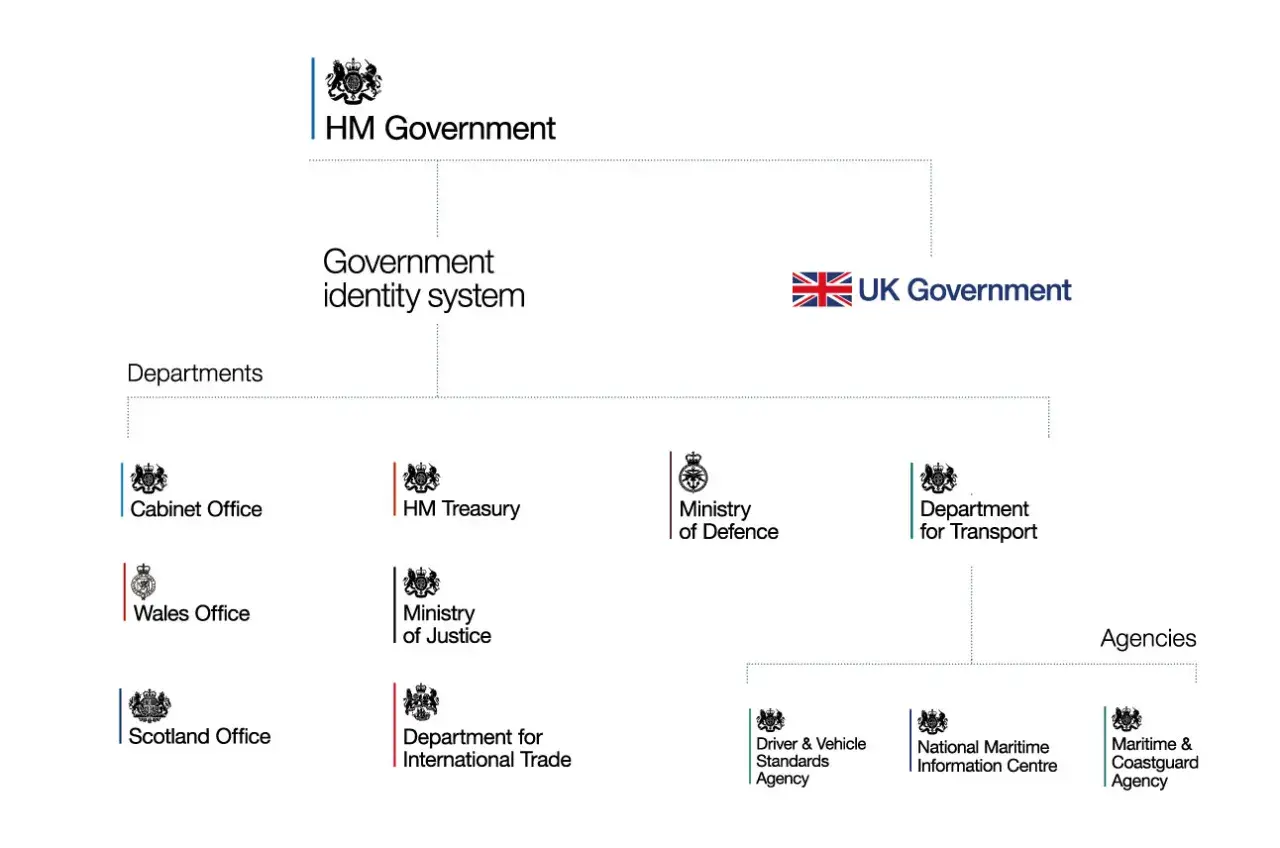
For UK government entities, the job is even broader. The identity must support legitimacy, consistency across departments, and a service mindset that feels clear rather than remote. I think of it as a trust architecture: the visual layer, the tone of voice, the channel choice, and the operational rules all have to point in the same direction.That is why public image work belongs in operations, not just communications. Once you accept that, the next question becomes how to structure the identity so it can scale without becoming confusing.
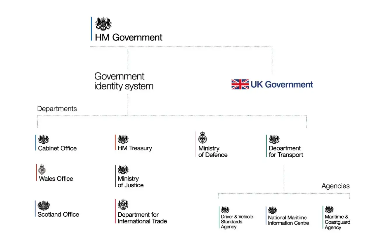
How to structure the identity so it scales
The fastest way to create confusion is to treat every initiative as if it needs its own look. In practice, I would separate the identity into three layers before designing anything:
| Layer | Best use | What should stay consistent | What can vary |
|---|---|---|---|
| Parent government brand | Core services, official notices, urgent public information | Logo, tone, naming rules, core colours, authority cues | Imagery, examples, call-to-action copy |
| Department or agency brand | Policy portfolios, operational updates, service explanations | Connection to the parent brand and approval route | Topic-specific visuals and content structure |
| Campaign brand | Behaviour change, short-term awareness, seasonal initiatives | Clear sponsor, consistent legal and accessibility checks | Message, creative style, channel mix |
The logic is straightforward: the more enduring and authoritative the message, the closer it should sit to the central identity. The more temporary and audience-specific the message, the more room you have to flex. A well-known service can justify a distinct identity, but that exception should be earned, not assumed.
That is the design rule I would use in the UK public sector: standardise the parts that signal authority, and localise only the parts that help people understand the service. Once that architecture is set, the hard part is governing it without slowing everything down.
How to build a credible identity system step by step
The latest GOV.UK brand guidelines now make clear that the identity must work across new channels and adapt to users, content, and context. That is the right direction, because a modern public brand has to hold up on a website, in an app, in a letter, in a social post, and on signage without feeling like five different organisations.
Here is the process I would follow:
- Define the promise. State in one sentence what the organisation wants the public to believe about it. Keep it behavioural, not vague. “Reliable,” “clear,” or “easy to use” is better than a slogan full of abstractions.
- Audit the touchpoints. Map every place the public meets the brand: forms, letters, press releases, paid ads, service pages, email templates, signage, and social profiles.
- Set the identity rules. Document how the logo appears, when sub-brands are allowed, what happens in partnership work, and who approves exceptions.
- Write the voice guide. A public-sector brand is weakened quickly by jargon. I would require plain language, short sentences, and active voice as the default.
- Build a governance route. Give teams a fast approval path, but make it explicit. Slow, unclear approvals create shadow branding, and shadow branding creates inconsistency.
The important part is that this is not just design work. It is an operating model. If the promise, the assets, and the approval process are aligned, the brand becomes easier to manage and cheaper to maintain. If they are not aligned, the system will drift no matter how good the visuals look on day one.
What works best across digital channels
Digital channels expose brand weakness very quickly. A website header, a social profile, an email footer, and a mobile screen all compress the identity into a tiny space, which means the public notices inconsistency much faster than they do on a printed brochure. That is why I treat digital branding as a usability problem as much as a design problem.
In practice, the strongest UK government brands do four things well:
- They make the sender obvious within a second.
- They use plain language that supports task completion.
- They keep visual treatment consistent across devices and channels.
- They design for accessibility from the start, not as a final check.
Accessibility is especially important because the brand is damaged if users need extra effort just to read, navigate, or trust the content. A clear structure, readable typography, sensible contrast, and plain wording are not compliance boxes alone; they shape how credible the organisation feels.
Digital brand safety also matters. Paid placements and organic content can sit beside misleading or hostile material if the rules are loose. I would always use a review process for placements, tone, and targeting so the brand does not look careless in moments where public confidence is fragile.
That digital discipline becomes even more important when multiple teams and external partners are involved.
How to manage partners, campaigns, and exemptions without losing control
Public-sector identity gets messy when too many stakeholders improvise. Departments, agencies, delivery partners, charities, contractors, and funded organisations all want a bit of visibility, but the public does not experience those arrangements as internal politics. They simply see a logo stack, a naming choice, or a message that feels inconsistent.
There are three situations I would watch closely:
- Co-branded work. The government mark needs prominence, and the partner role should be easy to understand. If the hierarchy is unclear, accountability becomes muddy.
- Funded campaigns. Where public money supports third-party delivery, the branding should make that funding visible. The point is not vanity; it is transparency.
- Brand exemptions. Some bodies need a distinct identity because their audience already trusts and recognises them, or because their service context is unusual. Exemptions should be justified, documented, and periodically reviewed.
One practical rule helps here: if a partner wants a stronger presence, ask whether that improves service uptake or only satisfies internal preference. Those are not the same thing. In my experience, the answer often reveals whether the branding decision is strategic or simply decorative.
The other useful discipline is to prepare for international communication separately. The UK government mark used overseas may need to be more recognisable than a domestic version, so the identity should be planned with context in mind rather than copied blindly from one channel to another.
Where public brands usually break down
The biggest mistakes are rarely dramatic. They are small, repeated failures that gradually weaken trust. I see the same patterns over and over:
- Too many identities. Every team wants its own version, and the public ends up wondering whether different messages come from different organisations.
- Over-designed visuals. Government identity should feel clear and steady, not theatrical. When the design tries too hard, it stops feeling official.
- Jargon-heavy copy. The message may be internally precise, but it becomes inaccessible to the public.
- Inconsistent approvals. If exceptions are granted ad hoc, the whole system loses credibility.
- Measuring the wrong things. Likes and impressions can look healthy while recognition and trust stay weak.
The most expensive mistake is treating the brand as a visual refresh instead of a management system. A new colour palette will not fix confusing service paths, slow response times, or contradictory messaging between departments. If the operational reality is weak, the public image will eventually reflect that weakness.
That is why the next question should always be: how do we know whether the brand is actually doing its job?
How to know whether the brand is working
I would measure public image work with a mix of perception, behaviour, and governance indicators. A strong brand is not just recognised; it helps people understand the organisation faster and act with less friction. That means the measurement set should be broader than campaign analytics.
| Signal | What to track | Why it matters |
|---|---|---|
| Recognition | Aided and unaided recognition, logo consistency, sender clarity | Shows whether people can identify the organisation quickly |
| Trust | Survey scores, complaints, sentiment, repeat contact levels | Shows whether the identity supports confidence in the institution |
| Usability | Task completion, bounce rate, call deflection, search success | Shows whether the brand helps people find and use services |
| Governance | Approval time, number of exceptions, compliance errors | Shows whether the system can scale without breaking down |
| Campaign performance | Recall, engagement, conversion, traffic quality | Shows whether short-term communications are landing properly |
If I had to choose only three measures, I would start with recognition, task completion, and trust. That combination tells you whether the public can identify the organisation, use its services, and believe what it says. Everything else is secondary to that.
From there, the right move is not to polish the visuals endlessly. It is to tighten the operating rules, fix weak touchpoints, and give teams a system they can actually use.
What I would prioritise in the first 90 days
If I were stepping into a new public-sector communications or leadership role, I would begin with the basics that have the biggest downstream effect. First, I would audit the visible identity across the highest-traffic touchpoints and remove obvious inconsistencies. Second, I would write down the rules for when the parent brand must lead, when a department can flex, and when a campaign needs its own identity.
Then I would review the voice of the organisation. If the language is too technical, too defensive, or too fragmented between teams, the brand will feel weaker than the visuals suggest. Finally, I would create a simple approval and exception process so people can move quickly without improvising their own version of the brand.
That is the practical heart of effective public-sector branding: clear identity, disciplined governance, and communication that makes the organisation easier to trust and easier to use. If those three things are in place, the logo matters far less than the experience around it.