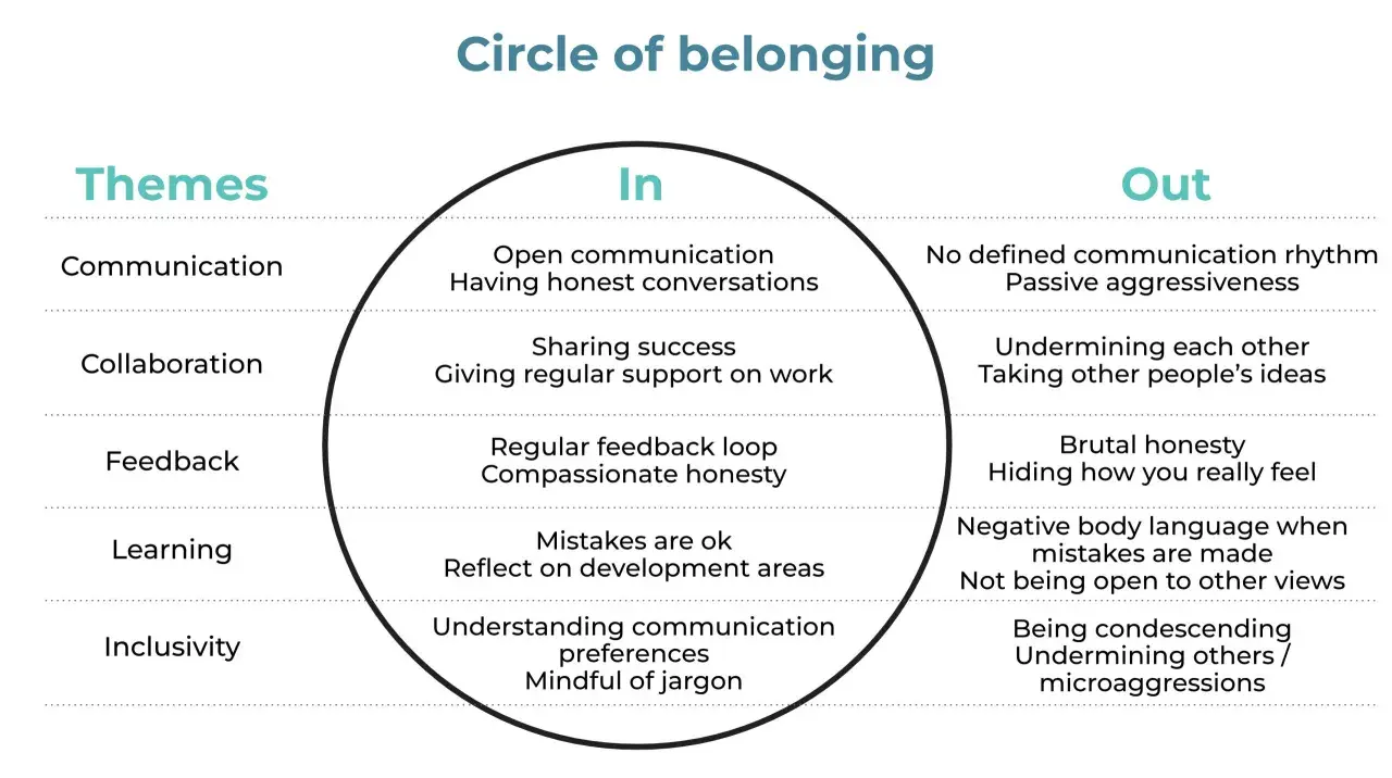
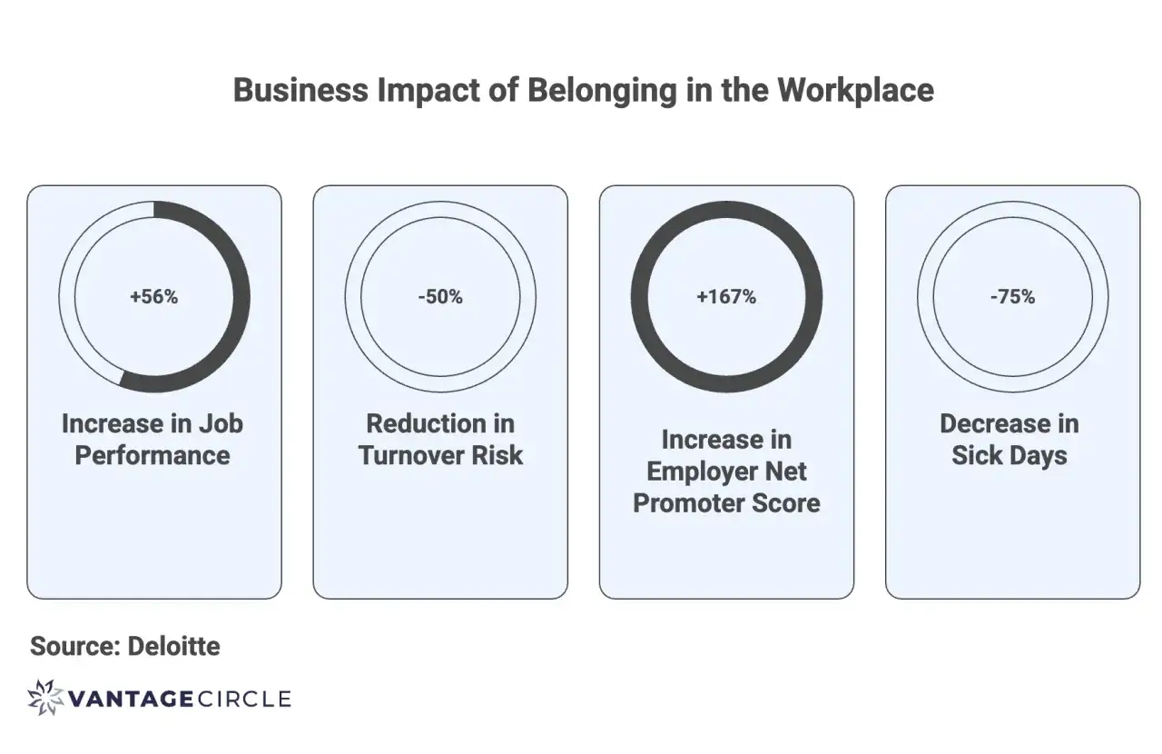
Belonging is one of those culture signals that leaders feel before they can prove it. There is a practical answer to how to measure belonging: turn it into a small set of repeatable signals that show whether people feel accepted, respected, safe, and able to contribute. For public-sector teams, that matters because weak belonging shows up quickly in turnover risk, silence in meetings, and uneven experience across grades, locations, and protected groups.
The fastest way to measure belonging is to combine a short survey, a few outcome metrics, and follow-up listening
- Use 5-8 Likert items to build a belonging score, then report both the mean and the top-two-box favourable rate.
- Segment results by team, grade, location, tenure, and protected characteristics where sample size allows.
- Pair perception data with retention, absence, grievance, internal mobility, and bullying or harassment signals.
- Run one annual benchmark plus quarterly or monthly pulses after change, not a one-off survey.
- Protect anonymity with a minimum reporting threshold of 10-15 responses, or whatever your governance standard requires.
What belonging actually measures
I do not treat belonging as a soft feeling with no operational value. It sits between culture and outcomes: inclusion creates the conditions, belonging reflects whether people actually experience them, and engagement shows how much energy they are willing to invest.
| Concept | What it asks | What it usually captures |
|---|---|---|
| Inclusion | Can people participate fairly? | Access, voice, respect, opportunity, psychological safety |
| Belonging | Do people feel accepted and part of the group? | Authenticity, connection, trust, being valued, fit |
| Engagement | Do people bring effort and commitment? | Pride, motivation, advocacy, discretionary effort, intent to stay |
The distinction matters. A team can be highly engaged and still feel cliquey. It can also feel welcoming on the surface while people quietly believe they cannot speak up or progress. If I want to understand belonging properly, I need to measure the felt experience, not just the mood.
That is why the next step is not to ask a single global question, but to identify the specific signals that make belonging visible in daily work.
The signals worth tracking first
When I build a belonging measure, I look for four layers of evidence rather than one headline number.
- Direct sentiment - items about being accepted, respected, safe, heard, and able to be authentic.
- Behavioural outputs - whether people stay, move internally, speak up, or take leave.
- Equity gaps - whether one grade, department, location, or demographic group is consistently lower than the rest.
- Qualitative clues - comments about meetings, managers, recruitment, progression, and everyday micro-behaviours.
If a team scores well overall but one subgroup is 8 to 12 points lower, I treat that gap as the real story. In public-sector settings, that split often appears before it becomes a retention issue or a grievance issue.
The Civil Service People Survey is a useful model here because it does not collapse everything into one culture score. It separates engagement, inclusion and fair treatment, and bullying and harassment, which is much closer to how belonging actually works in practice.
That layered view leads naturally to the question of what your score should look like and how short it can be without becoming flimsy.
How to build a score that is actually usable
If you want something stable enough to track over time, use a brief validated scale rather than an improvised one-off question. Recent work in PLOS One developed a 7-item Belonging at Work Scale and found it reliable across several employee groups, which is exactly the kind of structure I would borrow when I need comparability and rigour.
When I design a score, I usually keep it simple:
- Use one idea per item.
- Keep the response scale consistent, usually a 5-point agree/disagree scale.
- Cover a balanced mix of authenticity, voice, fairness, connection, and safety.
- Calculate a composite score from the same items every time.
- Report the mean score and the share who respond positively.
| Domain | Example item | Why it helps |
|---|---|---|
| Authenticity | I can be myself at work. | Shows whether people are masking to fit in. |
| Voice | My views are listened to. | Captures whether people feel psychologically included. |
| Fairness | People like me are treated fairly here. | Links belonging to equity and trust. |
| Connection | I feel part of my team. | Measures day-to-day group attachment. |
| Growth | People like me can progress here. | Connects belonging to opportunity and retention. |
I usually avoid overcomplicating the scale. Too many items slow response rates, and too many reverse-worded statements can muddy the data. Five to eight well-written items are normally enough for a recurring pulse, while a longer diagnostic survey can be reserved for deeper reviews.
Once the score is defined, the next question is how to collect it in a way that does not distort the results you are trying to understand.
Which tools to use and what each one misses
No single method is enough on its own. A survey tells you how much belonging people feel; conversations and operational data tell you why that number looks the way it does.
| Method | Best for | Main limitation | My take |
|---|---|---|---|
| Annual or biannual survey | Benchmarking and trend tracking | Slower to reflect change | Best backbone measure for a public-sector dashboard. |
| Quarterly pulse | Checking whether interventions are moving the dial | Can be noisy if the sample is small | Useful after a policy change, restructure, or manager intervention. |
| Stay interviews or focus groups | Understanding what is driving the numbers | Small samples can overrepresent loud voices | Best used to explain patterns, not to replace the score. |
| Operational metrics | Seeing outcomes that often follow low belonging | They are lagging indicators | Track turnover, absence, internal moves, grievances, and promotion rates. |
| Open text comments | Finding the specific behaviours people notice | Hard to compare unless coded consistently | Excellent for themes like exclusion, voice, and manager behaviour. |
Accessibility matters here as much as wording. If people cannot complete the survey easily on a phone, with assistive technology, or in their preferred language or format, the sample is already biased before the first answer is collected.
I also prefer anonymous collection for belonging work unless there is a strong reason not to. People are much more likely to be honest about exclusion, bias, or disrespect when they believe the feedback cannot be traced back to them.
That still leaves one difficult task: reading the results without telling yourself a comforting story.
How to read the results without fooling yourself
The most common mistake is to celebrate a healthy organisation-wide score and miss the fact that a few groups are clearly struggling. I would rather have a slightly messy dashboard that shows the truth than a polished one that hides the problem.
Here is the order I use when I review belonging data:
- Look at the overall trend first.
- Check response rate before trusting the score.
- Cut the data by team, grade, location, and tenure.
- Compare demographic groups where sample size is large enough to protect anonymity.
- Look for alignment with manager trust, development access, workload, and fairness measures.
- Cross-check with turnover, sickness absence, grievances, and internal mobility.
Small samples need discipline. As a rule of thumb, I would avoid reporting very small groups at all, and I would treat 10 to 15 responses as a minimum floor only if your governance rules permit it. For trend shifts, I pay more attention when I see a change of 3 to 5 points repeated across more than one pulse, because one noisy month can mislead you.
In the UK public sector, location and grade often matter as much as identity categories, so I always check those first. A low score in one directorate may have more to do with line management, workload, or local culture than with the organisation as a whole.Once you have a credible read on the data, the point is not to admire the chart. It is to decide what to change.
What to do when the score is weak
Low belonging is useful only if it changes behaviour. In my experience, the best interventions are targeted at the driver behind the score, not just the score itself.
| If the weakest area is | Likely issue | First move |
|---|---|---|
| Authenticity | People are masking to fit in | Review meeting norms, speak-up behaviour, and manager capability. |
| Voice | People do not think their views matter | Change decision-making routines and make follow-through visible. |
| Fairness | Development, reward, or workload feels uneven | Audit promotion, assignments, flexible working, and performance processes. |
| Safety | There is fear of speaking up | Strengthen reporting routes and deal directly with bullying or harassment. |
| Connection | People feel isolated from the team or organisation | Improve onboarding, team rituals, and cross-team relationships. |
I would not expect a campaign alone to move these numbers very far. If workloads stay unmanaged, if line managers are not trained, or if promotion decisions remain opaque, the belonging score tends to stay stubbornly flat.
The stronger approach is to assign an owner, define a fix, and measure the same items again after the change has had time to work. That is where a short, reliable cadence becomes more valuable than a big annual launch.
A practical cadence for public-sector teams
If I were starting from scratch in a council, department, or arm’s-length body, I would keep the rollout simple and disciplined.
- Weeks 1-2: choose 5-8 belonging items, one open comment question, and a reporting threshold.
- Weeks 3-4: test accessibility, launch the survey, and explain why anonymity and response rates matter.
- Month 2: cut the results by team, grade, location, tenure, and safe demographic groupings.
- Month 3: pick two driver areas to fix, not ten.
- Month 6: rerun the pulse and check whether the movement is real.
The short version is this: belonging is best measured as a repeated, segmented, mixed-method signal, not as a single vanity metric. If you get the question design right, protect the data properly, and act on the gaps people are showing you, the score becomes useful rather than decorative.